Link to website for original photo here !
It's pretty isn't it? :)
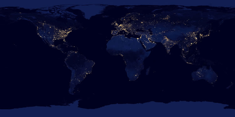
This map shows the geographical distribution of the cities.
The brighter it is, the bigger the population in that particular area.
I found all these when I was studying about rural pharmacy and stuff.
This makes me wonder, how's life like in those places with uber bright lights? Bright spots on the map also represents the wealthier population. And what about those areas with no lights at all? How's their life like? A small city..? Or... Living in poverty?
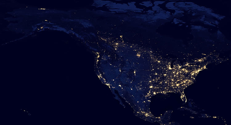
United States, Canada, Mexico and the Caribbean
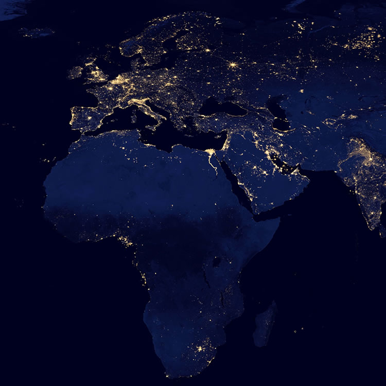
Europe and Africa.
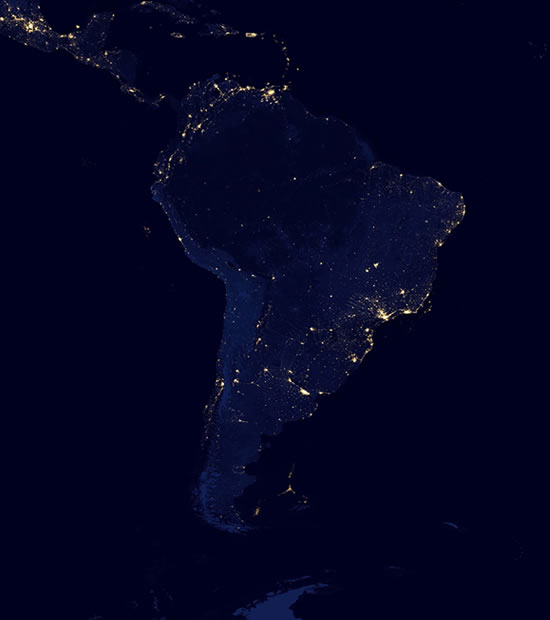
South America.
And last but not least,
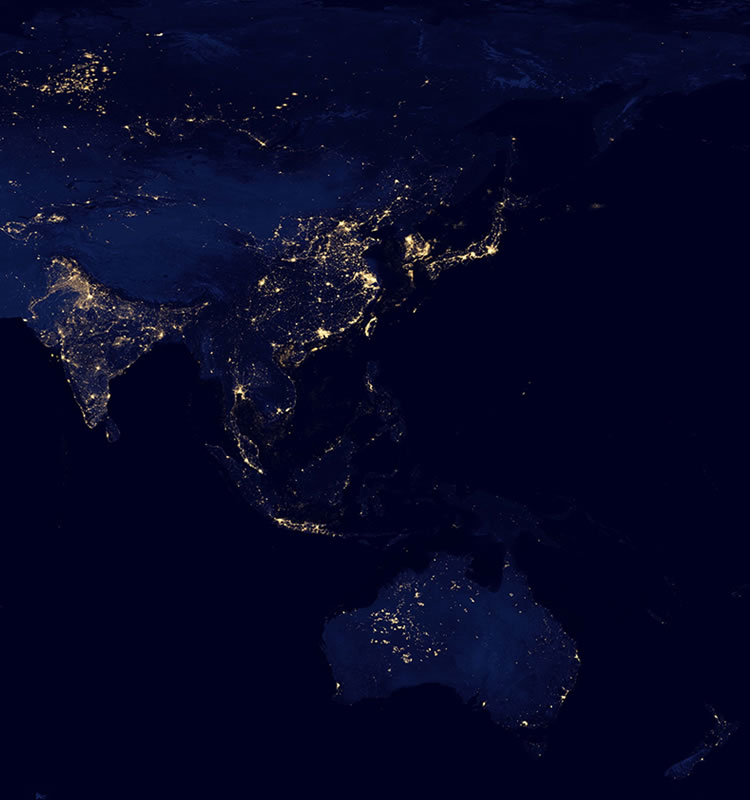
Asia and Australia :D
Alright, should go back to my lecture notes now. I want to make a difference..?
No comments:
Post a Comment